Venus Health Rebranding
Revitalizing Venus Health involved a comprehensive rebranding, delivering a modern logo, refreshed visual identity, and detailed guidelines. The project enhanced their clinic’s interior and exterior, creating a welcoming and professional experience that better reflects their patient-focused approach to advanced pain relief.

![]()
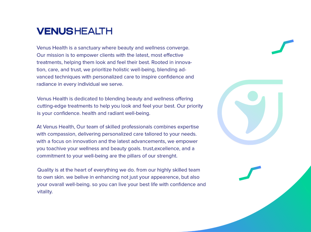
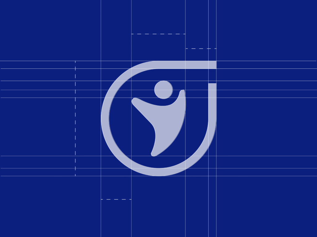
The new Venus Health logo embodies a sense of vitality and forward movement. The abstract figure, rendered in a vibrant teal, suggests an individual reaching upwards, symbolizing recovery and improved well-being. Encircling this figure is a dynamic, flowing line in a lighter teal, representing continuous care and a holistic approach to health. The integration of the ‘V’ from Venus within the abstract form subtly reinforces brand recognition. The overall design is clean, modern, and conveys trust and optimism in the journey to better health.

![]()

![]()
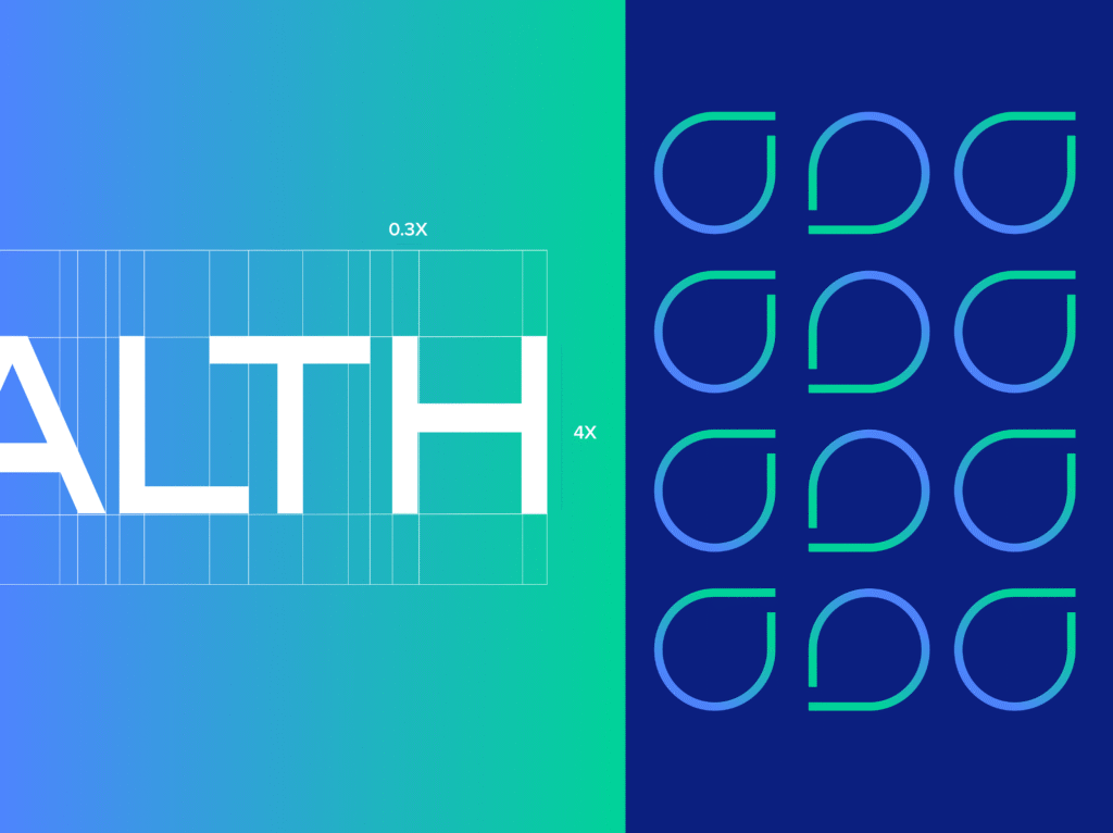
The brand identity refresh for Venus Health aimed to modernize its image while retaining a sense of trust and professionalism. The core color palette was updated to include a primary vibrant teal, associated with healing and tranquility, complemented by a lighter teal for dynamism and a clean white for clarity. Typography was chosen for its legibility and contemporary feel, ensuring effective communication across all platforms. The refreshed identity emphasizes a patient-centric approach, focusing on positive outcomes and a supportive environment for healing and recovery.

Brand Guideline
The comprehensive brand guideline established clear rules for the consistent application of the Venus Health identity. It detailed the correct usage of the logo in various sizes and contexts, specified the primary and secondary color palettes with their respective CMYK, RGB, and HEX codes, and outlined the approved typography for headings and body text. The guideline also provided examples of visual language, including the appropriate use of imagery and graphic elements, ensuring a unified and professional brand presentation across all touchpoints, both online and offline.

Specific design rules were established to ensure consistency and impact in all visual communications. These rules dictated the appropriate spacing and sizing relationships between the logo and other elements, the consistent application of the color palette to create visual harmony, and the use of typography to maintain readability and brand voice. Guidelines were also provided for the treatment of photography, emphasizing authentic and empathetic imagery that resonates with the target audience seeking pain relief and improved mobility. These rules ensure a cohesive and recognizable brand experience.
![]()
![]()
Lorem ipsum dolor sit amet, consectetur adipiscing elit. Ut elit tellus, luctus nec ullamcorper mattis, pulvinar dapibus leo.