Mulang realestate brand identity project
This project focused on a Singapore-based real estate client, Mulang. The challenge was to create a brand identity that conveyed both sophistication and modern appeal, setting them apart in a competitive market. The goal was to embody trust, growth, and professionalism.

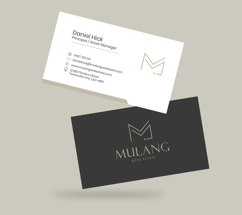
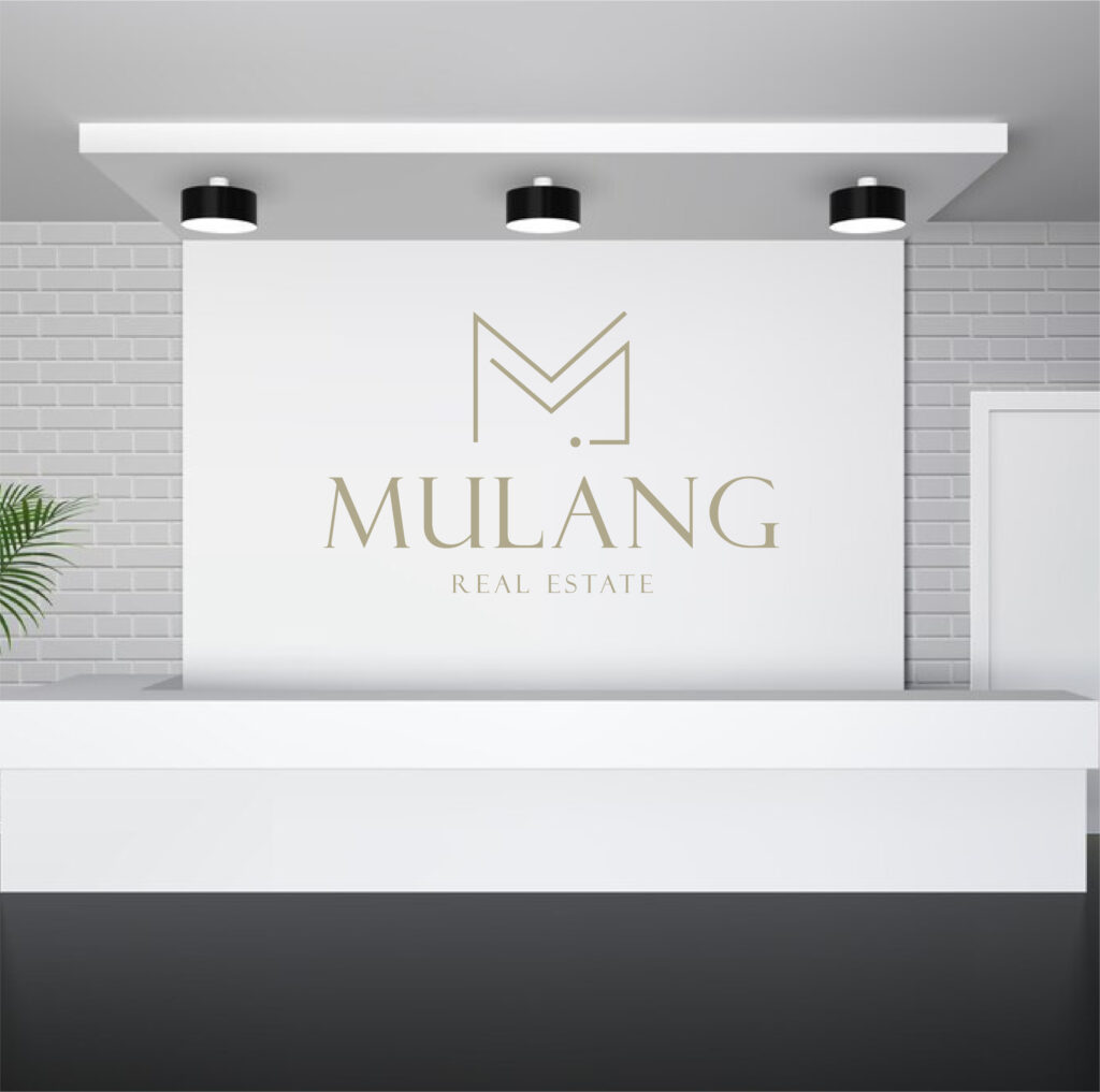
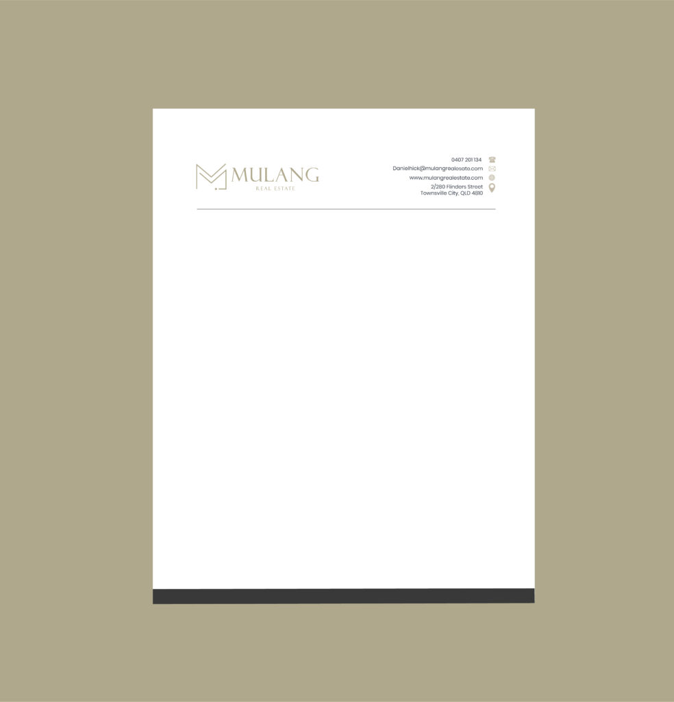
Our approach centered on a clean, contemporary design style. We developed a striking logo, a refined color palette, and a suite of brand assets. The design emphasizes clear communication and a memorable visual presence, tailored for the real estate sector.
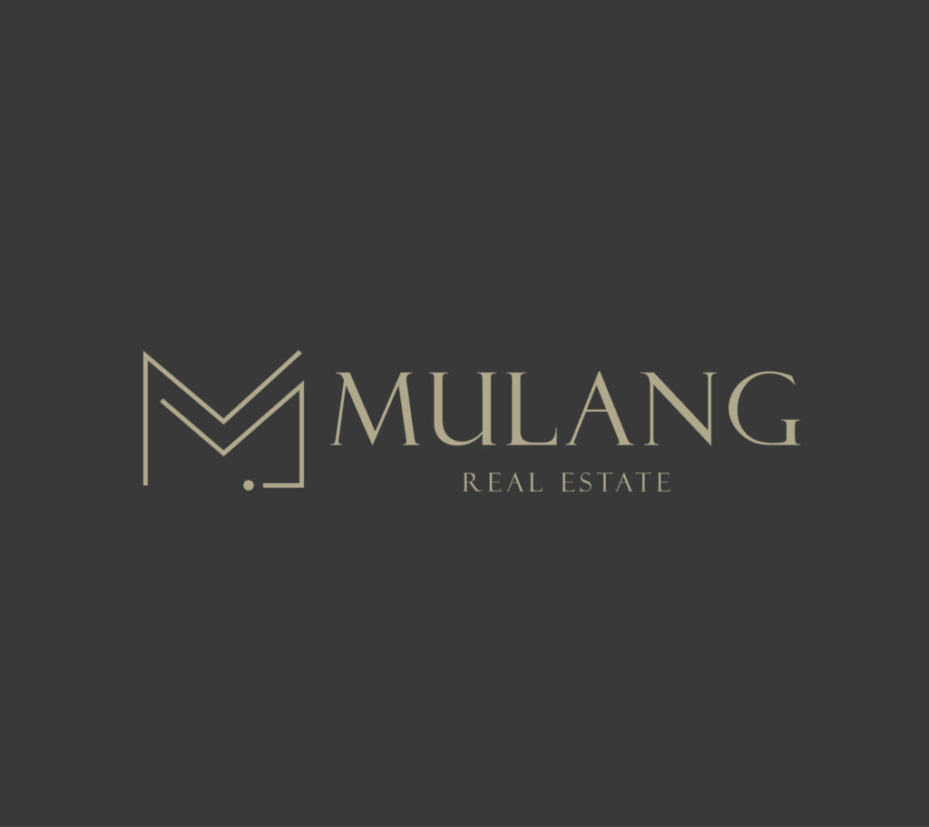
The Mulang brand uses a sophisticated color palette, typically including deep blues (#091a2b, #005163) and a lighter accent (#a8aeaf). These colors convey trust, stability, and professionalism, which are crucial in the real estate sector. Blue is frequently used in real estate logos to inspire confidence, while the lighter accent adds a touch of modernity.
The logo, often incorporating the letter ‘M’ with elements like buildings or keys, reinforces the brand’s focus. This combination of color and imagery creates a strong visual identity that resonates with the target audience seeking a reliable and contemporary real estate partner.
![]()
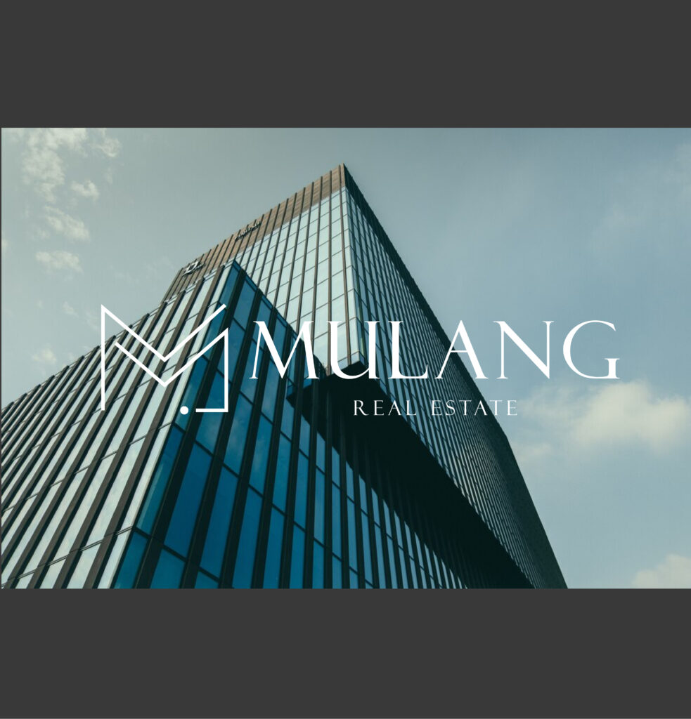
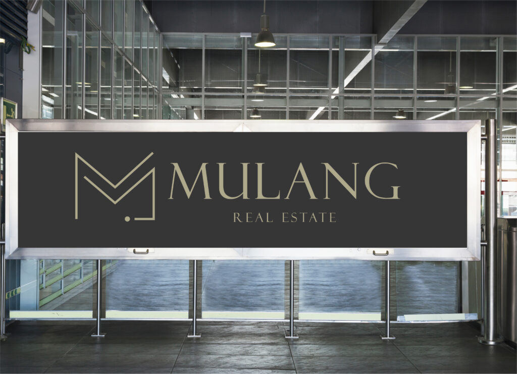
The solution is a powerful brand identity that captures Mulang’s commitment to excellence. The new identity provides a strong foundation for their market presence, ensuring a memorable and impactful brand image across all platforms and materials.