Wellinks
Wellinks: Redefining COPD management through virtual care and technology. Seeking a trustworthy, innovative brand identity that empowers patients towards proactive respiratory health and improved living.
![]()
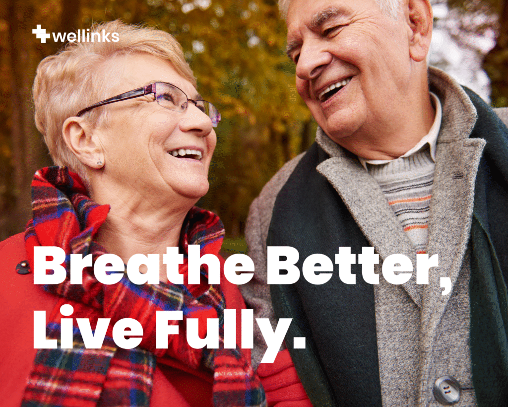
COPD management is often reactive, harming patient quality of life. Wellinks’ challenge: Craft a brand identity to communicate their proactive virtual care model, build trust, and convey hope in a traditionally reactive healthcare space.
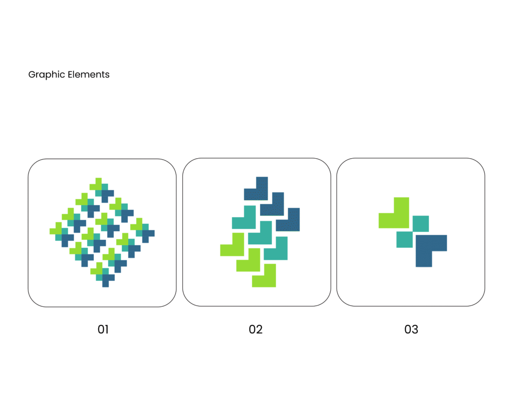
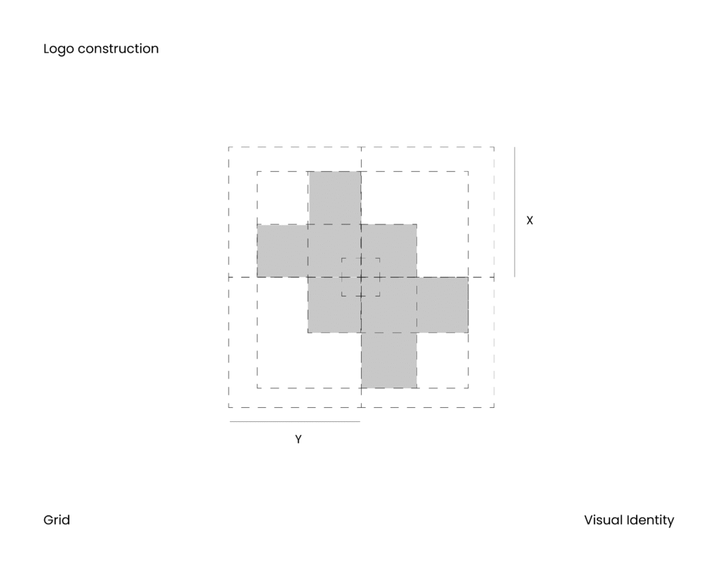
The Wellinks symbol is a stylized plus sign (+) composed of four distinct squares in varying shades of green and blue. This deliberate design visually communicates several key aspects of their solution: Health and Care, Integration and Holism, Progress and Forward Movement, Trust and Reliability, Empowerment and Support.
![]()
We focused on visuals of breath, connection, and progress. The color palette evokes trust and calm, while typography balances authority with approachability. The logo system reflects Wellinks’ values: trust, innovation, empowerment, and proactive care.
![]()
![]()
![]()
![]()
The chosen colors suggest natural authenticity and subtle elegance. The logo conveys timeless sophistication and clear communication, evoking trust and modernity, and aligning with the brand’s core values, avoiding superficial trends.